
Before & After Overview
This document provides an overview of the most significant changes introduced in the new CMS user interface. It is intended to explain what has changed, why it changed, and how the updated experience benefits users.
The UI refresh focuses on making the CMS easier to navigate, reducing complexity, and helping users complete common tasks more efficiently. Rather than introducing entirely new functionality, many of the improvements reorganize existing features into a more intuitive and consistent experience.
Navigation & Discoverability
The navigation has been restructured to improve discoverability and better reflect how users work within the CMS. Features have been reorganized into more logical locations, terminology has been clarified, and related functionality has been grouped together to make navigation simpler and more intuitive.
Navigation menu - Before

Navigation Menu - After

Key changes:
- Templates now have their own dedicated navigation item.
- Players have been renamed to Devices.
- Power Schedules and Device Labels have moved from Players (Called devices in new UI) to under the new Settings menu.
Updated workflows
Several workflows have been redesigned to improve visibility, reduce unnecessary navigation, and make everyday tasks easier to complete. Updated layouts provide more context at a glance while introducing a more consistent experience across the CMS.
Key changes include:
- A new filter panel replaces the previous filter dropdown.
- Side navigation for folders and device groups provides easier browsing.
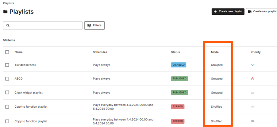
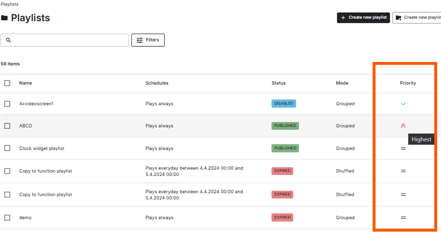
- Playlist overviews display additional information, including status, mode, and priority.
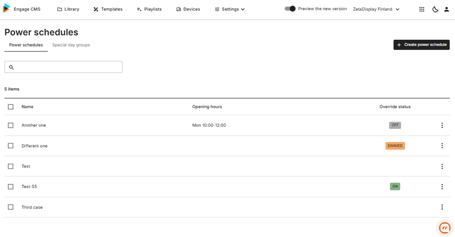
- Power Schedules have been redesigned with an improved overview and management experience.
- Device Labels have been updated with a refreshed workflow and interface.
Playlists
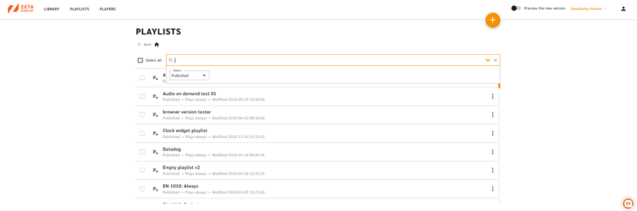
The Playlist overview has been redesigned to provide more information directly from the list view.
Playlist overview – Before
Playlist overview – After
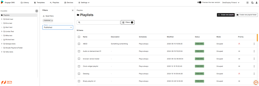
New functionality
· Playlist status shown with colour indicators.
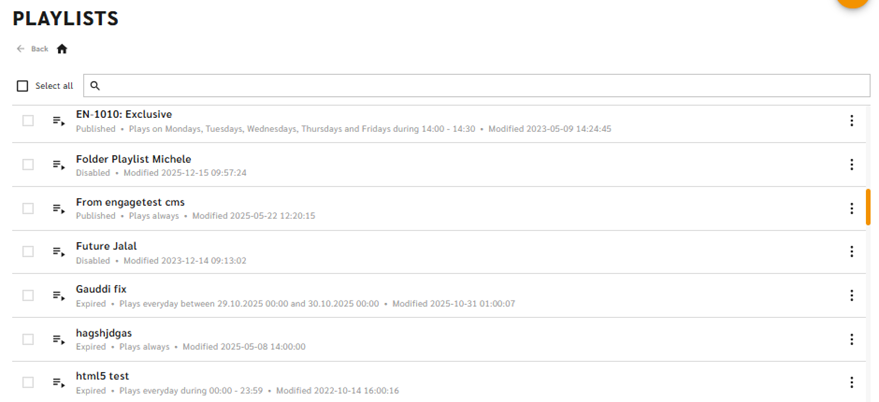
(Before)
(After)
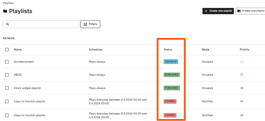
· Display mode visible directly in the overview.
· Playlist priority visible without opening the playlist.
Why it matters
· Faster status checks.
· Less navigation.
· Better overview of large playlist collections.
Workspace Selection
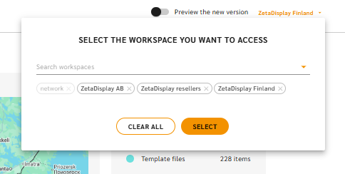
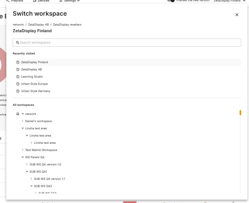
The workspace selector has been redesigned to help users who work across multiple workspaces navigate more efficiently.
(Before)
(After)
Key changes include:
- Improved workspace search.
- Clearer visualization of parent and sub-workspace relationships.
- A new Recently Visited section for faster switching between frequently used workspaces.
Power Schedules
Feature description: “Schedule screen downtime to reduce energy consumption”
Overview
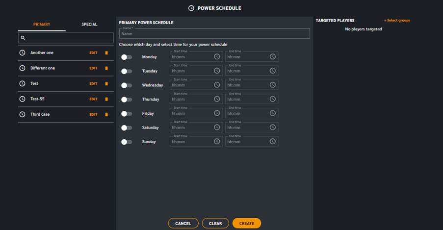
Power Schedules have been redesigned with a simplified management experience and several new capabilities for handling regular operating hours and schedule exceptions.
Power Schedule Overview & Edit – Before
Power Schedule Overview & Edit – After
(Overview)
Power Schedule Overview & Edit – After
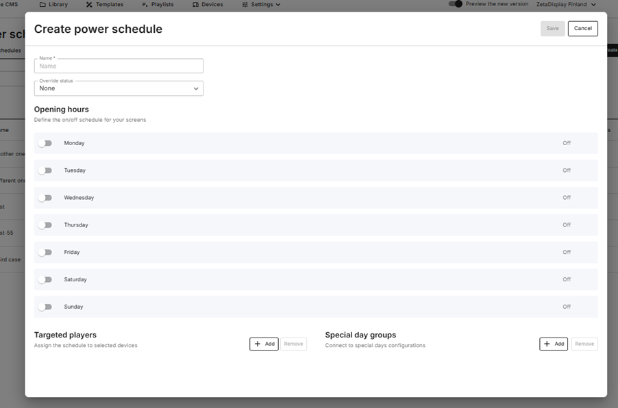
(Edit)
New functionality
· Redesigned schedule creation workflow.
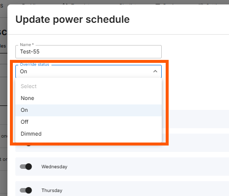
· Override device behaviour by forcing devices On, Off, or Dimmed during scheduled periods.
o None – Devices follow the normal power schedule.
o On – Devices stay On during the scheduled time, ignoring the normal power state.
o Off – Devices stay Off during the scheduled time, ignoring the normal power state.
o Dimmed – Devices remain On, but dims down the screen backlight during the scheduled time.
· Support for Special Day Groups, allowing specific calendar dates to replace the normal weekly schedule.
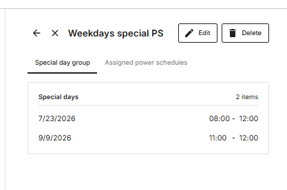
Why it matters
· Greater flexibility when managing exceptions.
· Easier scheduling for holidays, renovations, and special events.
· Reduced need to create duplicate schedules.
Labels
“Labels specify the rules for creating device groups”
(Before - Add labels to a new device group screenshot)
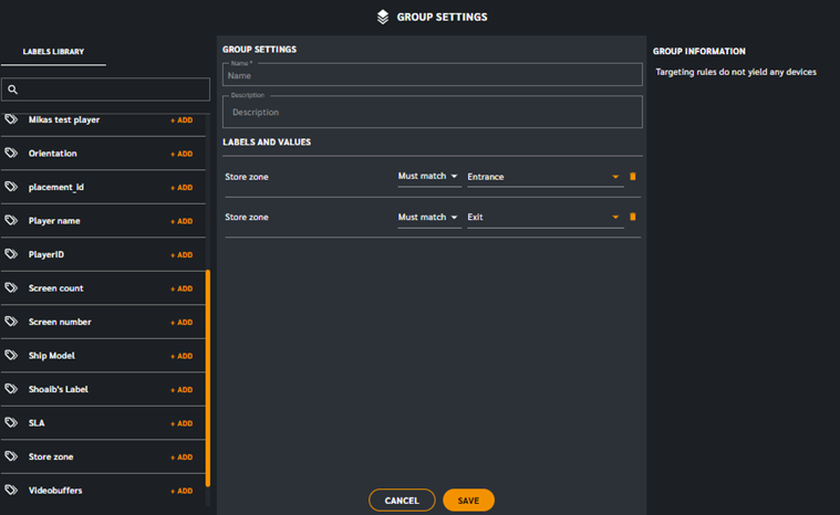
(After - Add labels to a new device group screenshot)
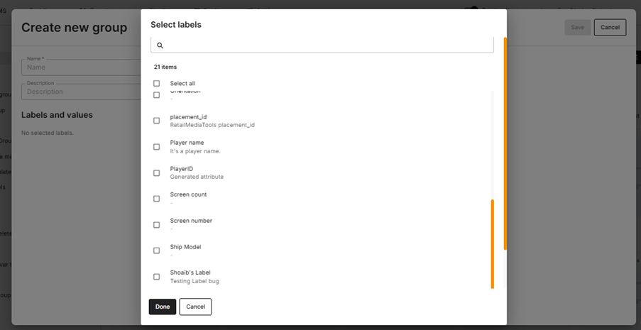
Overview
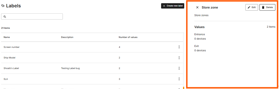
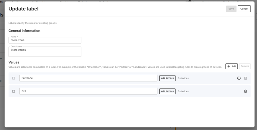
While the core functionality of Device Labels remains the same, the management experience has been redesigned to align with the rest of the CMS. Labels are now easier to browse, manage, and edit through a more consistent interface.
What has changed
· Dedicated overview page displaying all available labels.
(before)
(After)
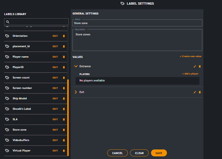
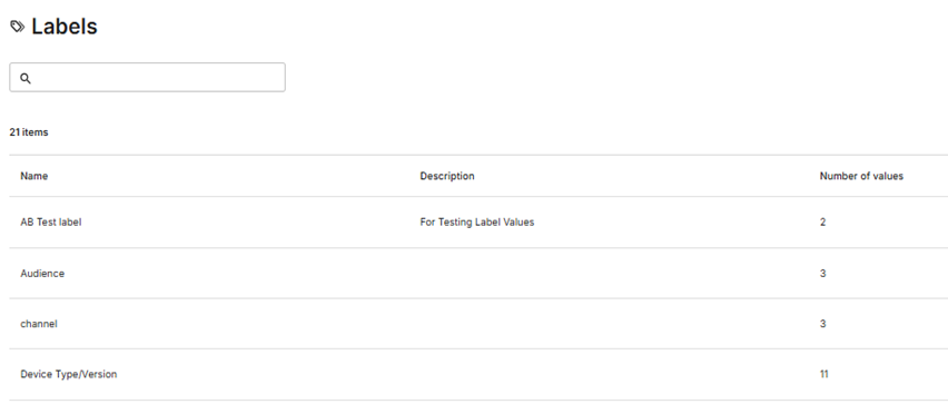
· Label details are now presented in the Sidekick panel for quick reference.
· Updated create and edit experience using a dedicated modal.
· Consistent page layout and management workflow across the CMS.
Why it matters
The updated experience makes Device Labels easier to find and manage while providing a familiar workflow that matches other areas of the CMS, such as the Library and Playlists. A consistent interface helps users navigate the system more confidently and reduces the learning curve when working across different features.
Page Side Navigation
Overview
A new side navigation has been introduced across multiple areas of the CMS, providing a consistent way to browse folders, subfolders, and device groups.
Previously, navigation varied depending on the page. The new side navigation creates a familiar browsing experience whether you're working with the Library, Playlists, or Devices.
What's changed
· Dedicated side navigation for folders and subfolders.
(Before)
(After)

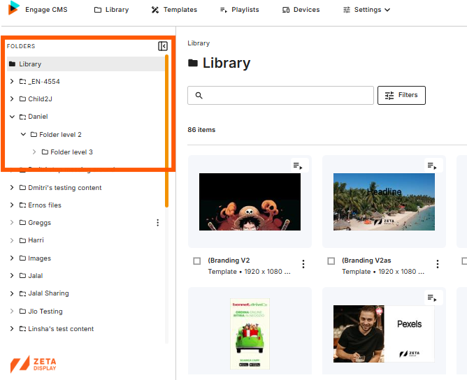
· Device Groups are now browsed using the same navigation pattern.
(before)
(After)

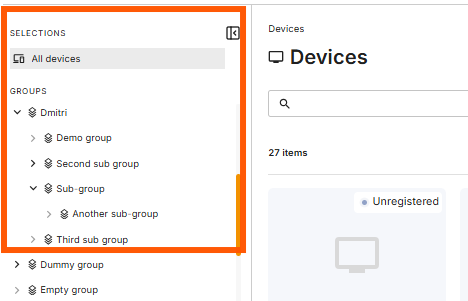
· Clearer visualization of folder hierarchy.
· Consistent navigation experience across multiple CMS pages.
Why it matters
The new side navigation makes it easier to browse large content structures and device groups while providing a more consistent user experience throughout the CMS. Users spend less time searching and can navigate between folders more efficiently.
Filters
Overview
The filtering experience has been redesigned to provide a clearer overview of available and active filters. Instead of using a dropdown menu, filters are now managed through a dedicated side panel.
What's changed
· New Filters panel replaces the previous dropdown.
(Before)

· (After)
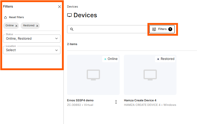
· Active filters remain visible while filtering.
· Easier access to all available filters for the current page.
· Consistent filtering experience across supported CMS pages.
Why it matters
The dedicated filter panel makes filtering easier to understand and manage, especially when working with larger datasets or multiple filters. Users can quickly see which filters are applied and adjust them without repeatedly opening and closing dropdown menus.